Astound UI Enhancements
Astound, which is an internet, TV and phone provider, was looking to us to improve the shop experience on their website. They found that users were not absorbing the add ons or “sweeteners” that came with each product option. We realised different components across the site didn’t feature the information in a consistent look and feel which made it hard for the user to follow through the different flows to the shop experience.
Team: Bounteous design team
Tools Used: Sketch, Illustrator
What We Improved
Getting rid of the information that was not useful to the user to
simplify the cognitive loadCalling out the “sweeteners” more in the product component. A huge
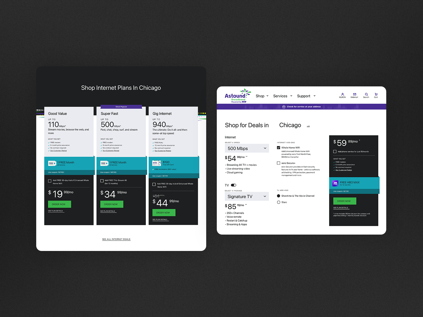
improvement was made by distinguishing the area that is included with the coupon code with the Astound brand teal colorBringing all instances across the site where the“Shop” information is featured to have a similar look and feel
We also incorporated illustrations and iconography to help each
product component be more scan-able so the user could compare each product package better
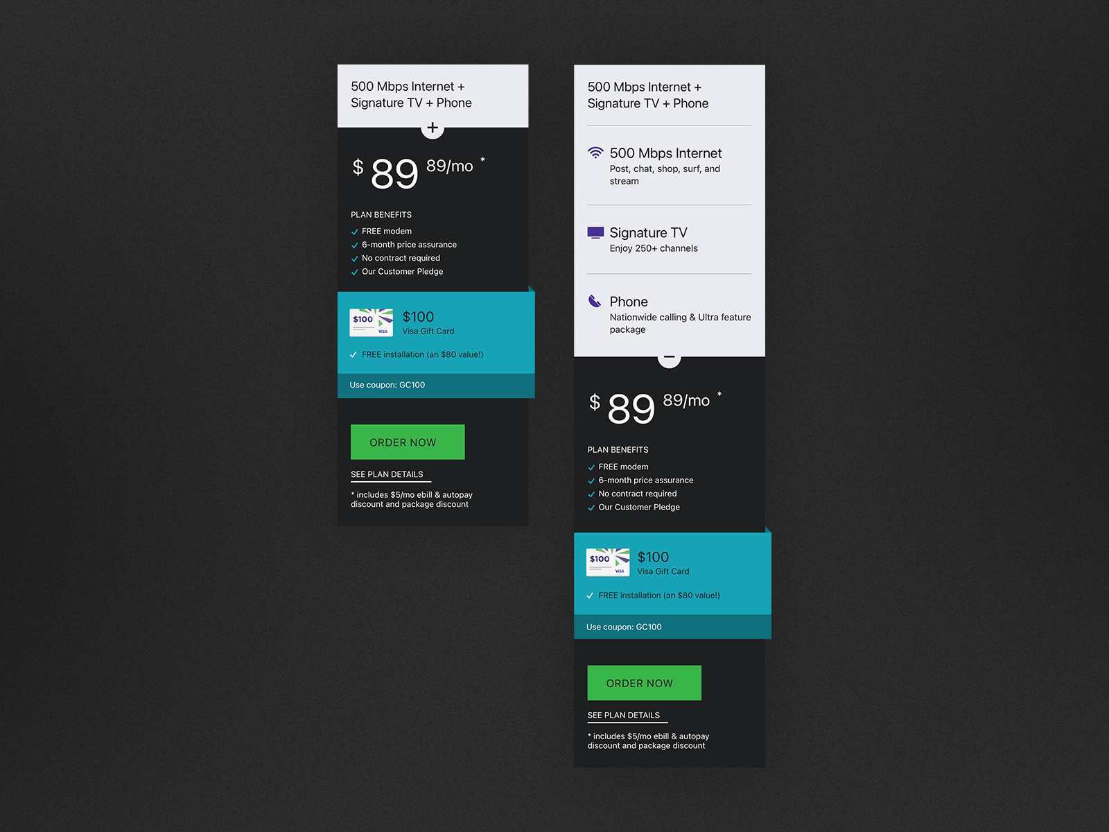
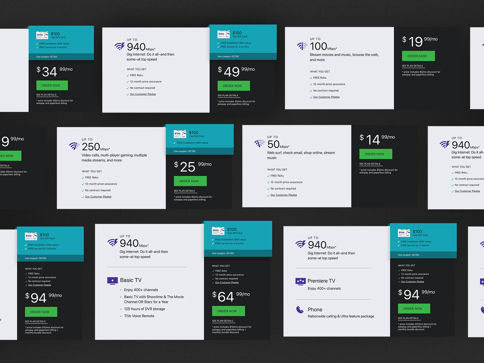
Flexible Component
The shop component, which is prominently featured on the dedicated “shop” page, had to be flexible enough to effectively accommodate a wide variety of different amounts of information. To achieve this goal, we meticulously kept the spacing and placement consistent between the various sections of information located on the right side of the component. For instance, the coupon code offer and the “What You Get” section consistently appear directly above the displayed price, with the coupon code (if there is one available) situated above the “What You Get” section for optimal visibility. Furthermore, the styles and logical structures we applied to the shop page components needed to be seamlessly carried through to other shop components that are featured throughout the entire site to ensure a cohesive user experience.
Icon Improvements
We also incorporated visually appealing icons that clearly distinguished between the various tiers of Internet speeds and TV Packages, ensuring that each deal is more easily scan-able as the user scrolls down the page. This approach not only enhances usability but also allows users to quickly identify the best options available to them.

Illustrations
Illustrations were strategically used in the promotional area to give that section more visual appeal and enhance its overall scannability. These carefully selected illustrations represented a variety of different items that were included with the promotional offer, helping to draw attention and convey the essence of the promotion effectively.
