Earthling Outerwear
Earthling Outerwear represents a thoughtful blend of art and lifestyle, rooted in the unique vision of Moss Artist, Kate The Earthling. The brand's identity has been meticulously crafted to resonate with Kate's personal logo, incorporating a consistent illustration style, color palette, and typography. This alignment not only strengthens the visual narrative but also ensures that the brand remains recognizable and cohesive.
Tools Used: Illustrator, Photoshop, Procreate
Versatility
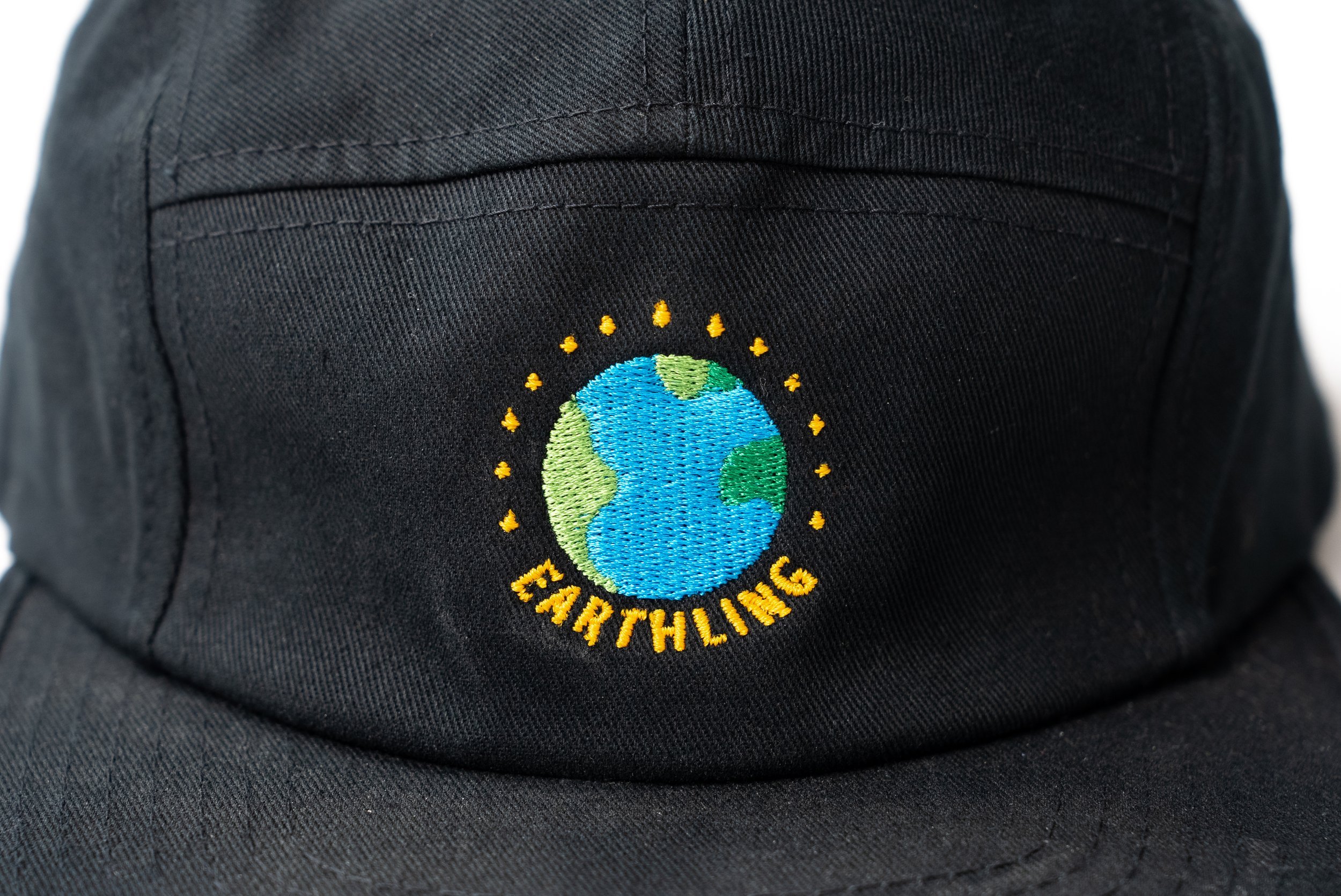
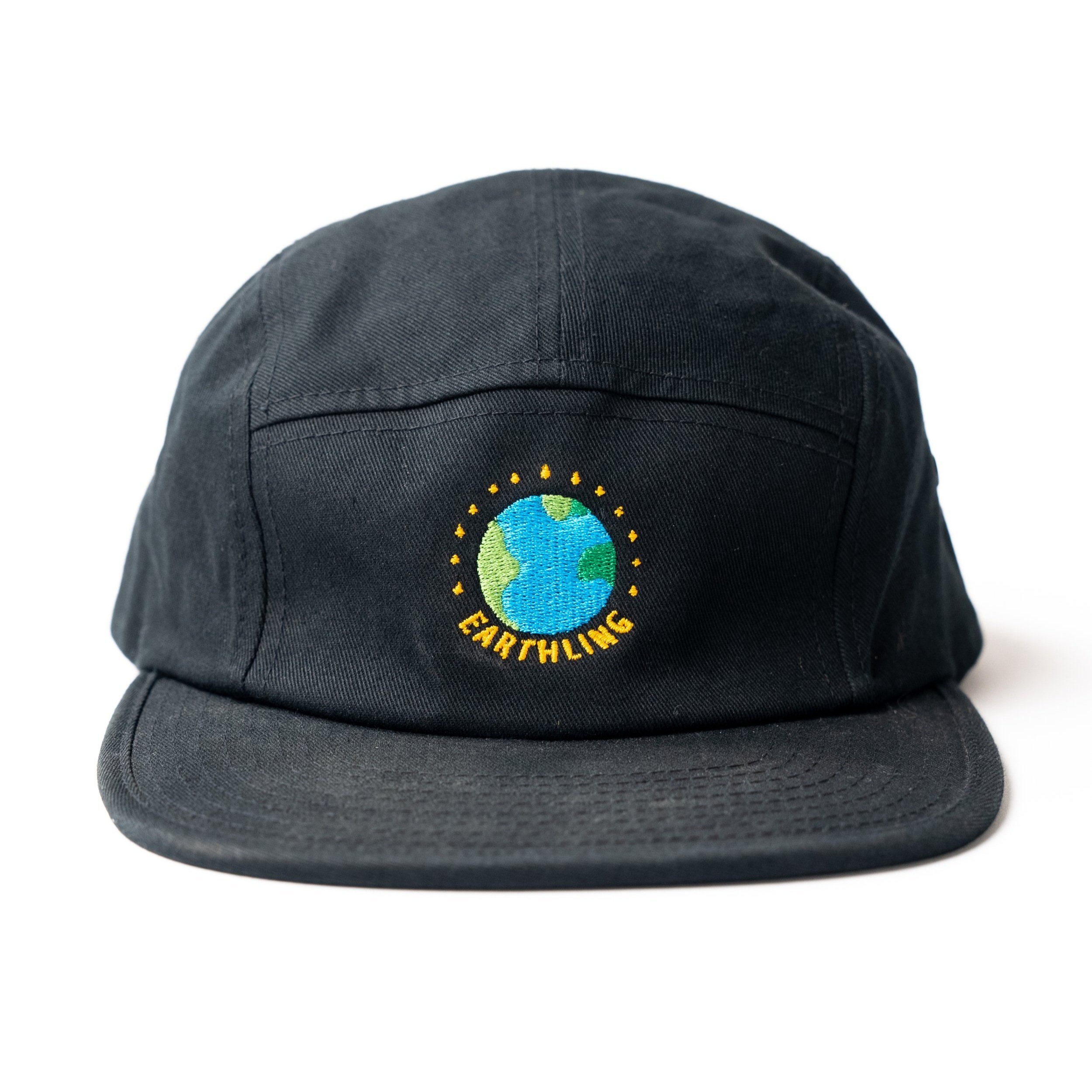
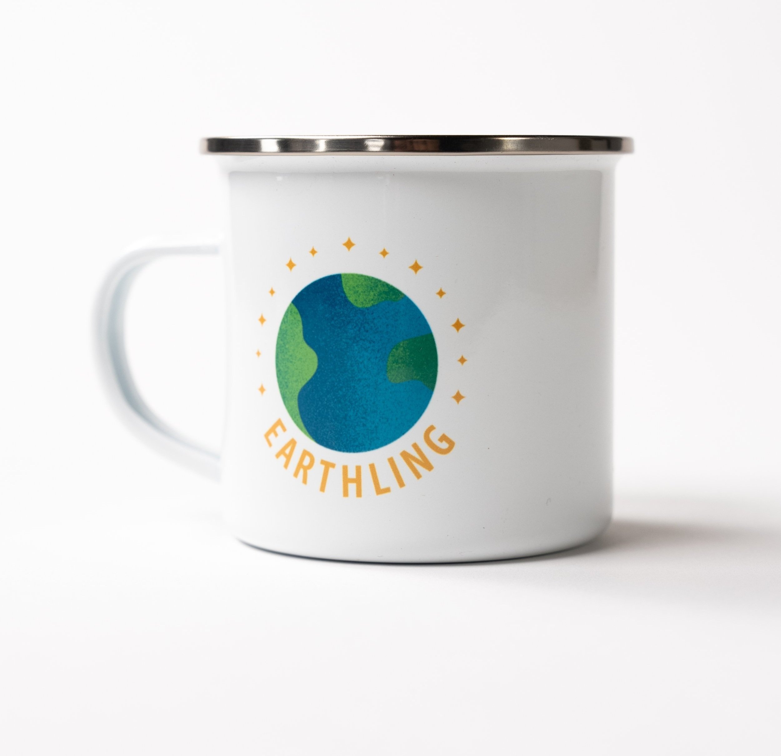
The incorporation of an adaptable "outline style" allows for versatility in application across various printing methods while preserving the brand's integrity.
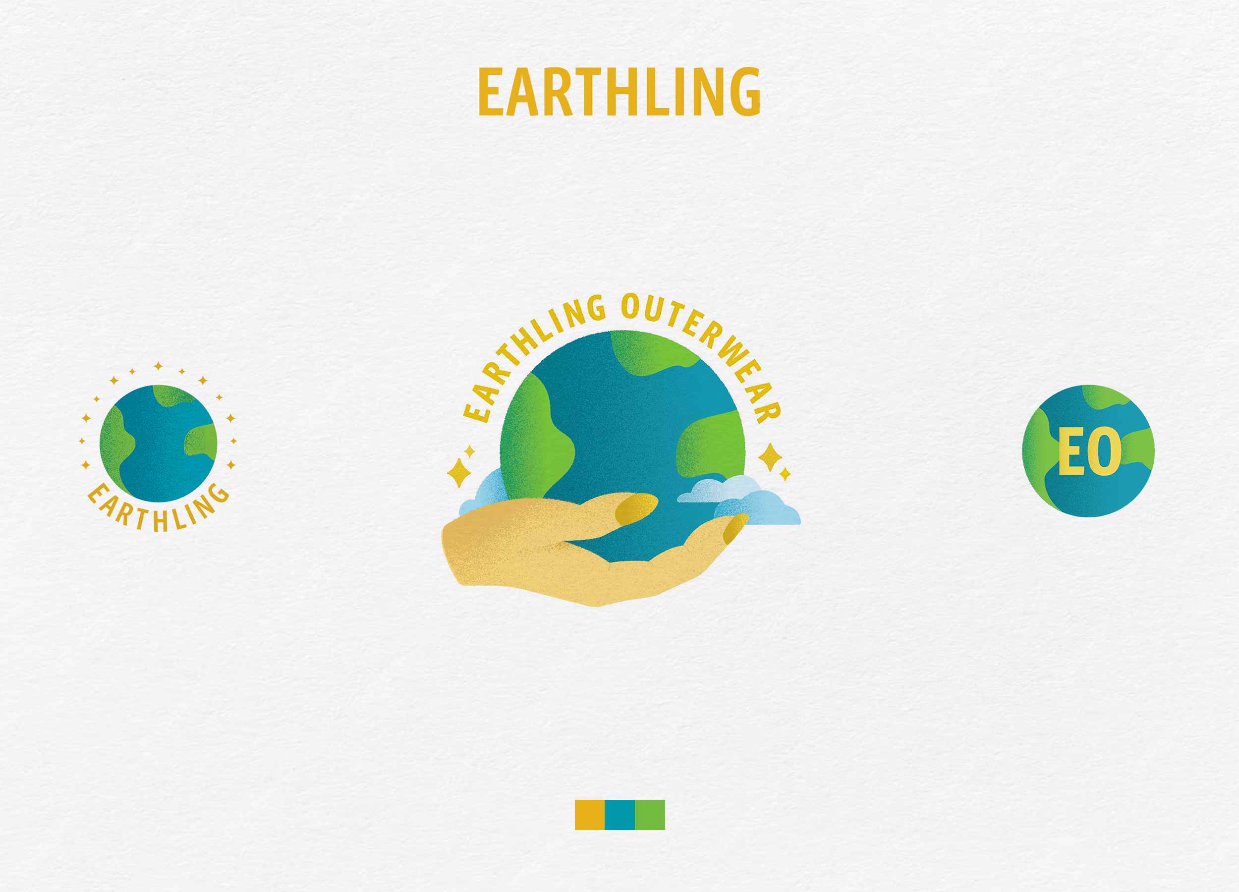
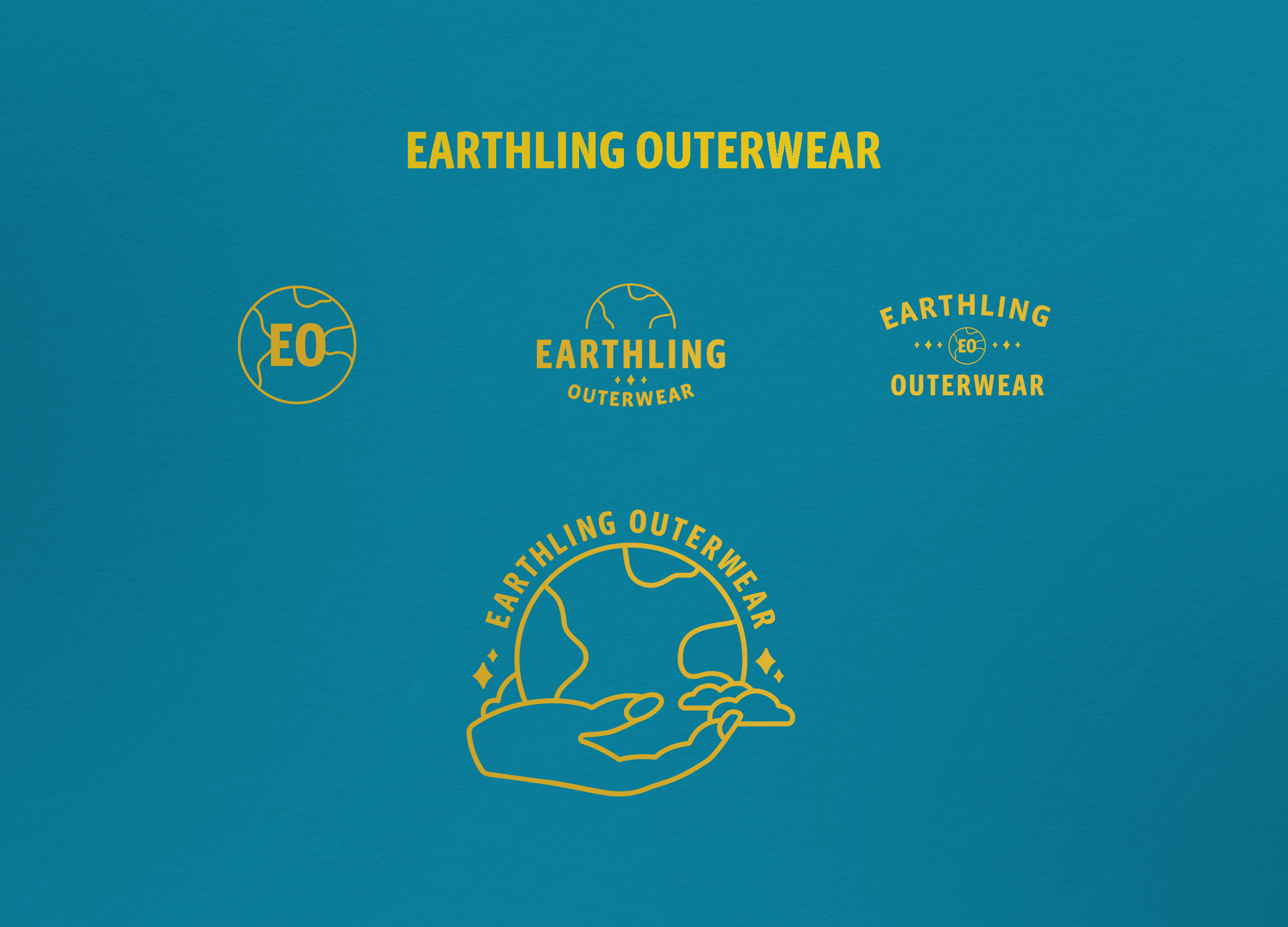
Various alternative logos were also created that relate back to the main. This approach emphasizes a dynamic identity that can evolve as Earthling Outerwear expands its offerings. By maintaining a fresh perspective, the brand avoids stagnation, reflecting its commitment to innovation and growth.

Process
I was sent an initial rough sketch, which served as a foundational starting point, and we ideated from there. My first thought was to create a text bend that arcs around the top half of the earth. Additionally, I aimed to simplify the logo so that there is less visual noise, allowing for a quicker read and an overall improved appearance at smaller scales. Ultimately, the final logo ended up being much simpler, all while still maintaining enough detail to ensure that the same concept could effectively work both as a straightforward graphic as well as a more colorful and detailed illustrative version.

Conclusion
In essence, Earthling Outerwear is positioned to grow alongside its founder's artistic journey, embodying a seamless connection between personal aesthetic and lifestyle brand potential. This careful balance of design and functionality lays a strong foundation for future developments and customer engagement.