All Axis Nutrition
A brand identity for a company dedicated to guiding clients toward their nutrition and fitness goals from every angle. The name “All Axis” reflects balance, multidimensionality, and a holistic approach to well-being. Paired with “Nutrition,” it emphasizes healthy eating, natural foods, and sustainable habits. The result is a logo that harmonizes these ideas—along with a brand that feels light, cheerful, and motivating.
Tools Used: Illustrator, Photoshop, Procreate

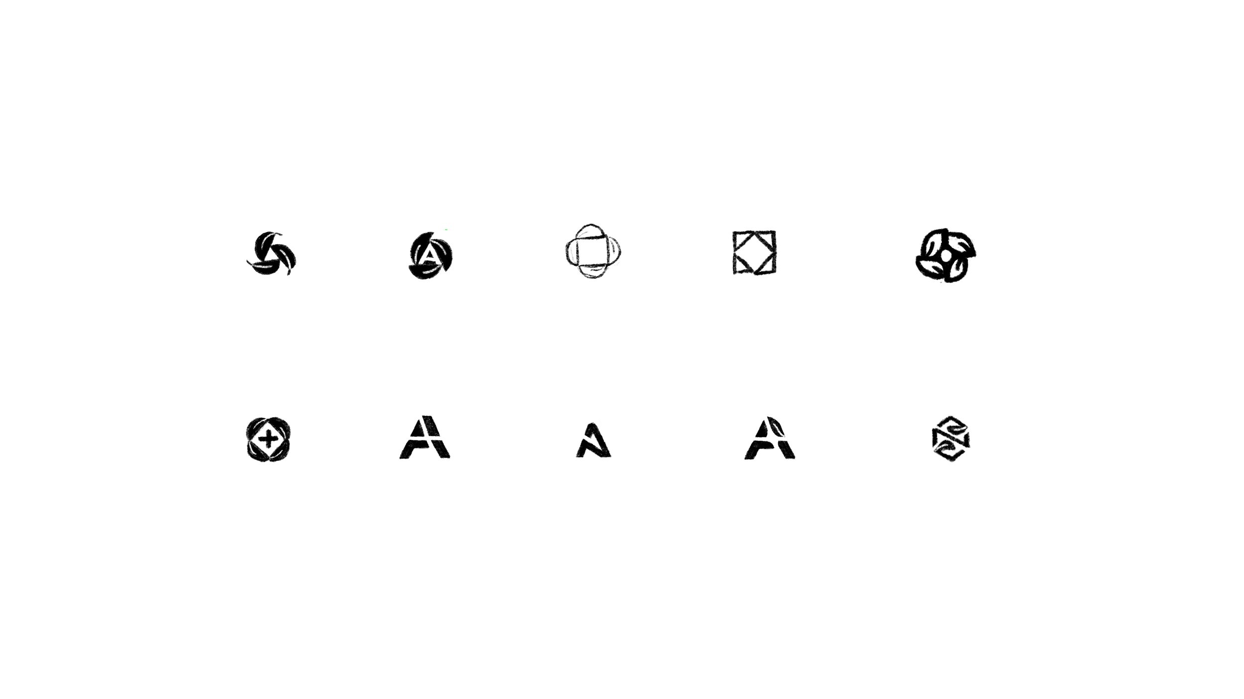
Sketching & Exploration
In the sketching stage, I explored various ways to represent axes and nutrition, often incorporating a leaf as a key element. Geometric shapes like triangles and squares, along with variations of the letter “A,” were early concepts. While the final logo evolved beyond these initial ideas, this exploration laid the foundation for its development as it was refined digitally.

Logo Concept.
The final logo incorporates a cube to symbolize the idea of “all axes,” representing a well-rounded, multidimensional approach. Each face of the cube features a leaf, seamlessly blending the concepts of balanced nutrition and overall health. This design captures the essence of All Axis Nutrition—a holistic, structured, and nourishing path to wellness.

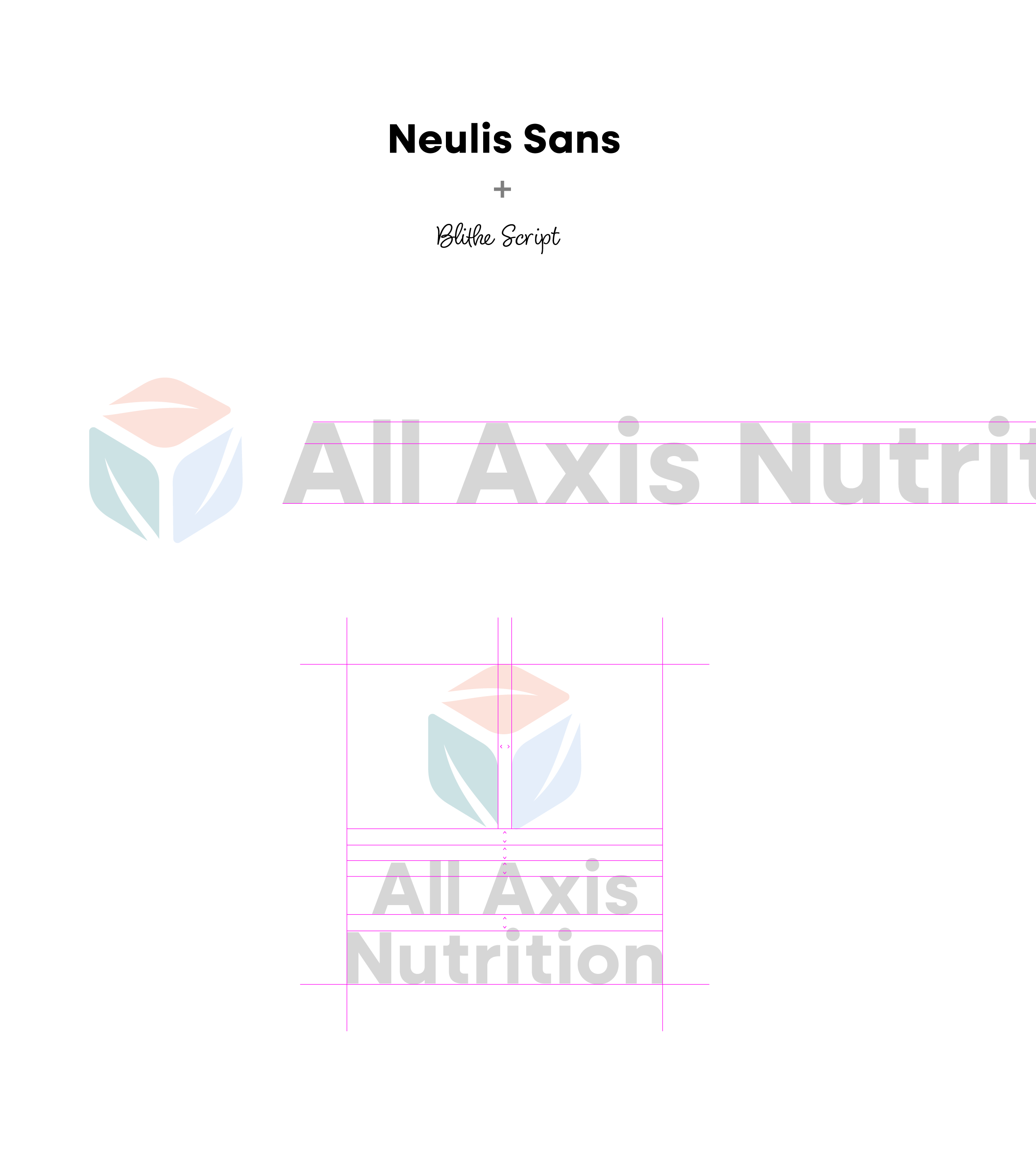
Typefaces and Spacing
A geometric sans-serif typeface with a high x-height was chosen to complement the structured nature of the logo while maintaining a friendly and inviting feel. The taller x-height enhances readability and approachability, reinforcing the brand’s balance of precision and warmth. Neulis Sans was up to the task!
To further enhance the brand’s inviting personality, a script typeface was introduced for selective use in key areas, adding a touch of warmth and approachability. Additionally, the spacing between the cap height and x-height influenced key design decisions, including the cube’s proportions, its relationship to the typography, and the overall line height—ensuring a cohesive and harmonious visual identity.

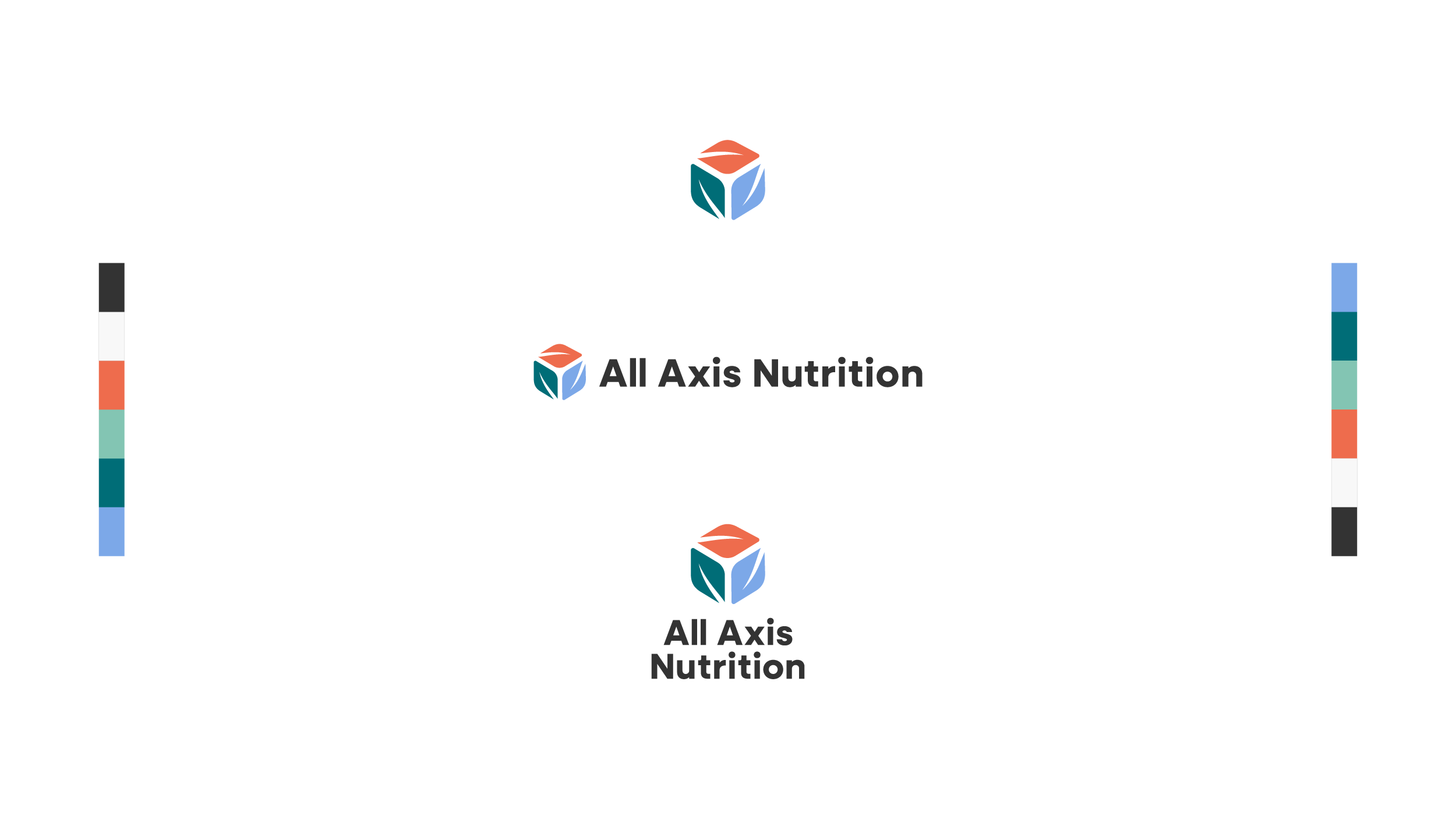
Final logos and Colors
To ensure versatility across different brand applications, the logo was delivered in three formats: icon-only, horizontal, and vertical. The color palette was carefully selected to be bold, friendly, and energetic, reinforcing the brand’s dynamic and approachable identity. The three-axis design incorporates three primary colors from a six-color palette, all chosen to work harmoniously together—creating a vibrant yet balanced visual system.

Conclusion
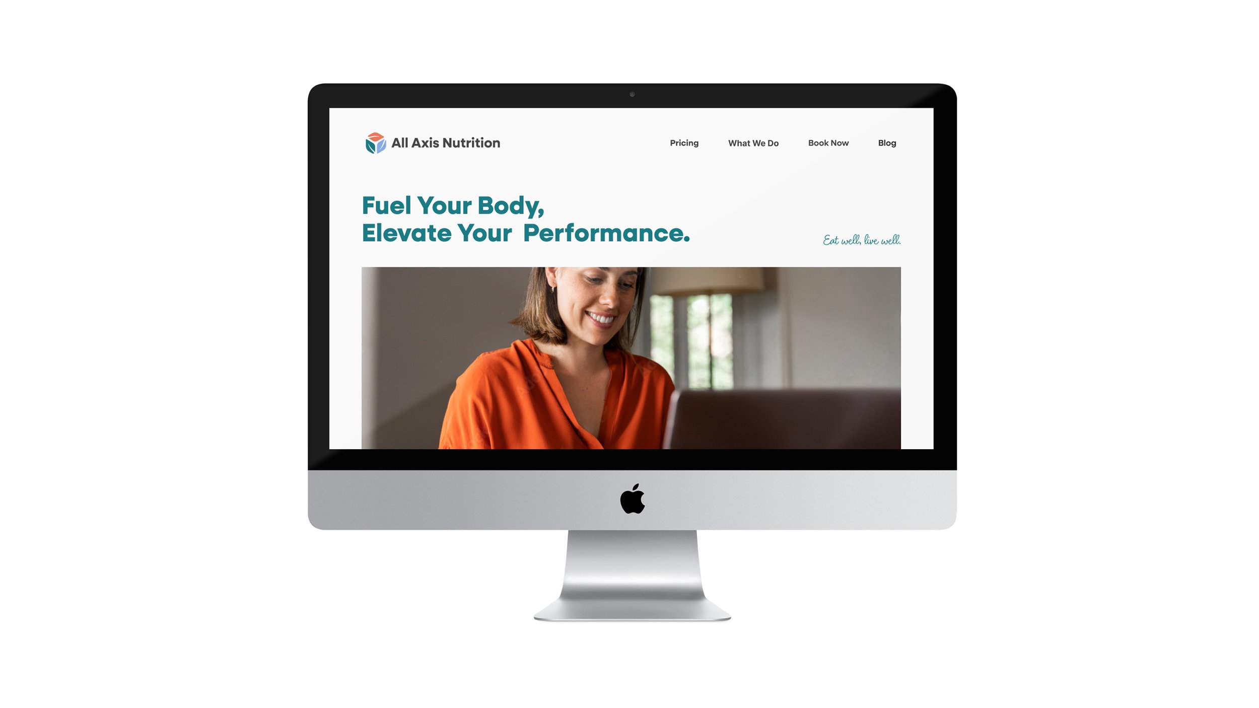
The final branding for All Axis Nutrition successfully balances geometry, nutrition, and an energetic, welcoming feel. From early sketches to the refined logo, typography, and color palette, every element was designed to reinforce the brand’s multidimensional approach to health and wellness. The client was extremely pleased with the outcome, and I’m excited to see how All Axis Nutrition grows and evolves with this strong visual foundation.

