General Motors Website Redesign
At General Motors, our team modernized the outdated ecommerce experience. We benchmarked industry websites to identify best practices and improve our site. We also implemented a new design system with a cohesive grid layout, modular components, and structured page templates for all brands.
Team: General Motors CX Design - Ecommerce
Tools used: Figma
One template for multiple brands
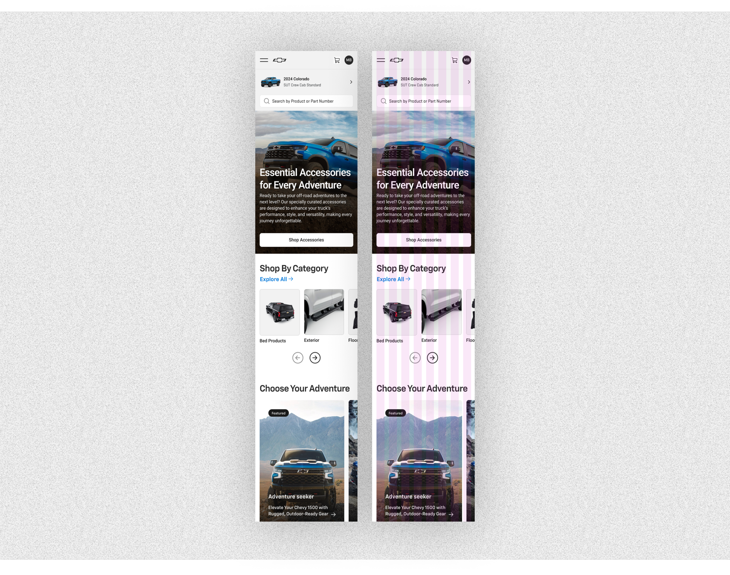
General Motors has four distinct car brands: GMC, Chevrolet, Buick, and Cadillac. As part of our project, we were tasked with creating comprehensive page templates that would extend from the department landing page, category landing page, product listing page, and the product detail page. This approach enabled the content team responsible for updating the website to function seamlessly within a familiar framework across all brands. The templates we designed needed to be clean, modern, and simple in their layout. This design strategy ensured that the unique characteristics of each brand could be effectively showcased through their individual fonts, colors, and imagery.


Improved buy flow
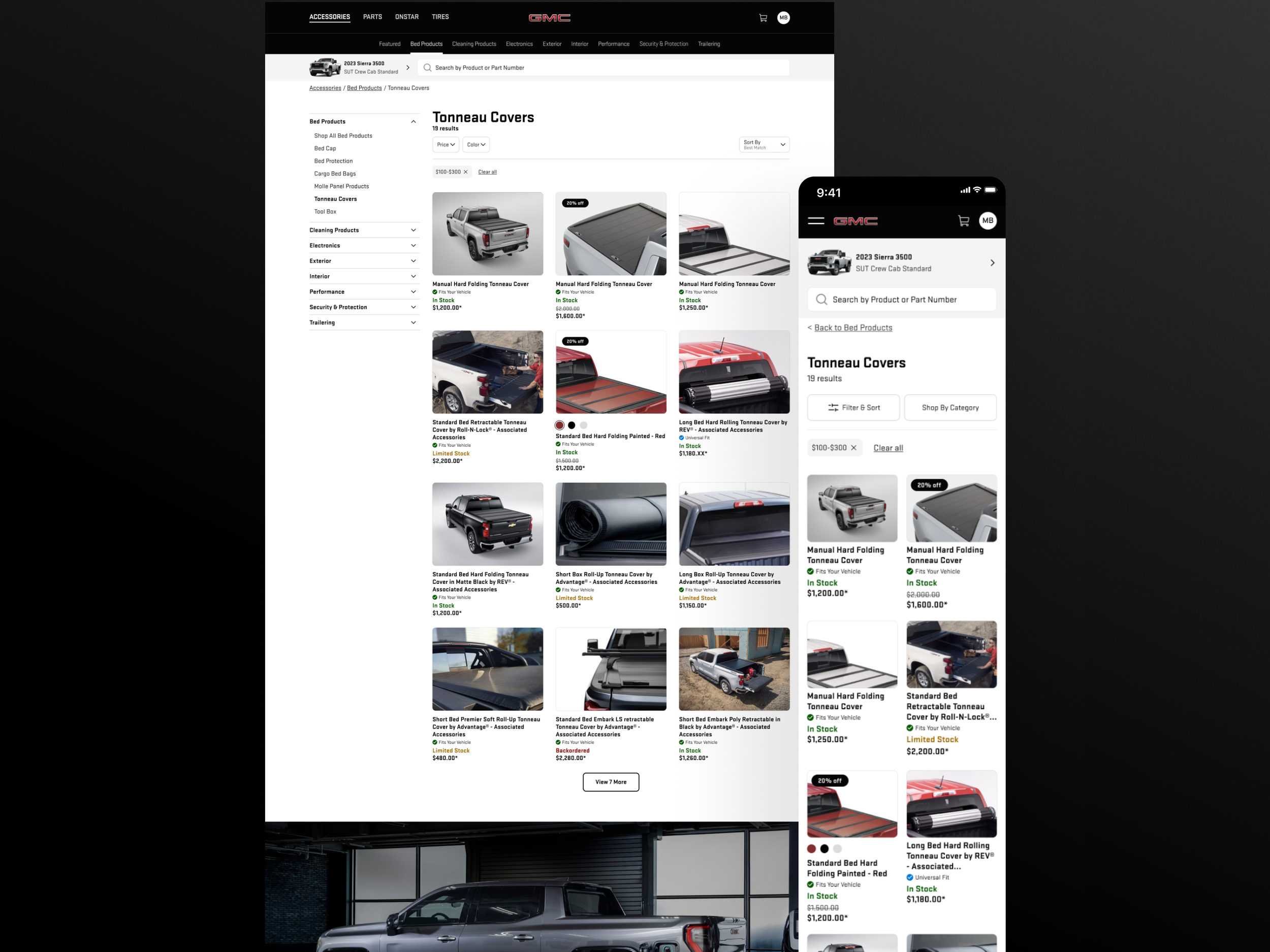
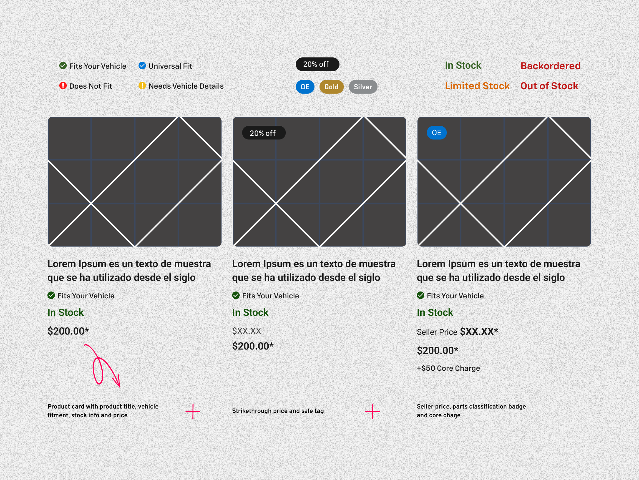
We also took steps to simplify the information that the customer needs to see displayed in the product cards compared to what is shown on the product detail page. The amount of details required is considerably more than what one would typically find on an average ecommerce product listing.
In the Product Listing Page, which is the first image displayed below. Each product card was designed to include essential vehicle fitment information. This feature indicates not only whether the product will fit the vehicle you have but also does so in the context of your profile when you are signed in. Additionally, we recognized the importance of showing vital stock information, along with various types of pricing, including sale prices and seller prices. This is particularly important for products that are exclusively purchasable through dealers or specific sellers.
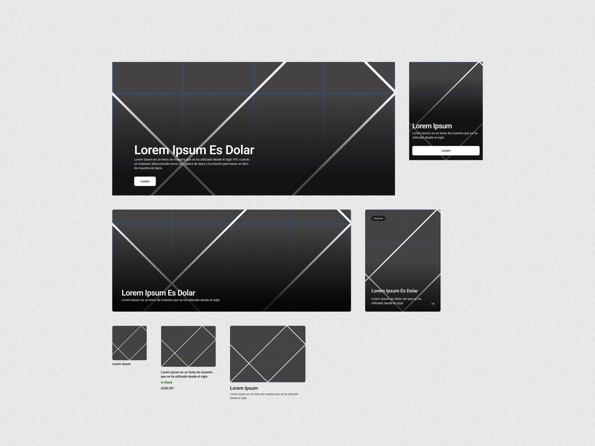
The Product Detail Page, which is the second image displayed below, is the specific location where you arrive after selecting a product of interest. Here, we delve deeper into information that customers need to consider carefully before making a purchase decision. This includes essential details such as rewards points , the seller's location if applicable, as well as various options for how you prefer to receive your product—whether that is through “Pickup," “Ship," or “Install.”

Navigation
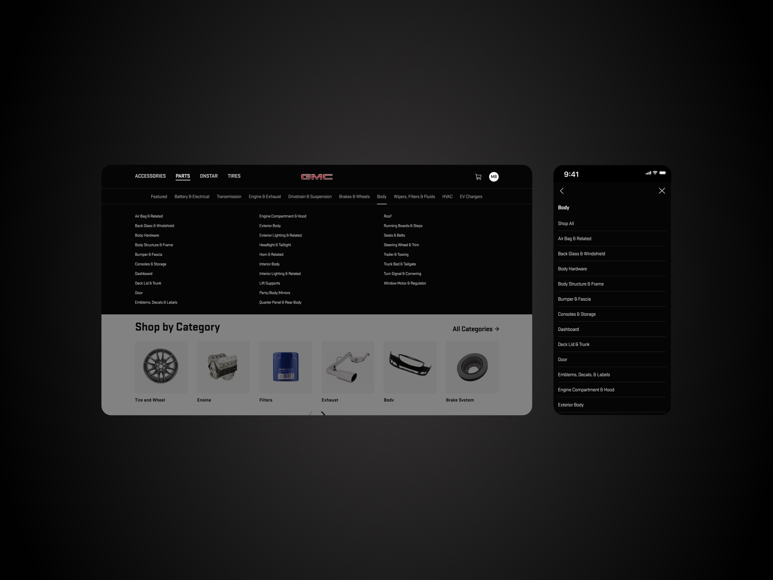
We took full advantage of the opportunity presented by redoing the navigation to allow the user to navigate the site more efficiently and intuitively. The old site unfortunately did not effectively surface the product categories and their corresponding subcategories. By introducing a streamlined “flyout” navigation system, the customer no longer has to wait until they reach the “Product Listing Page” to explore the various product categories and subcategories, enhancing their overall shopping experience significantly.
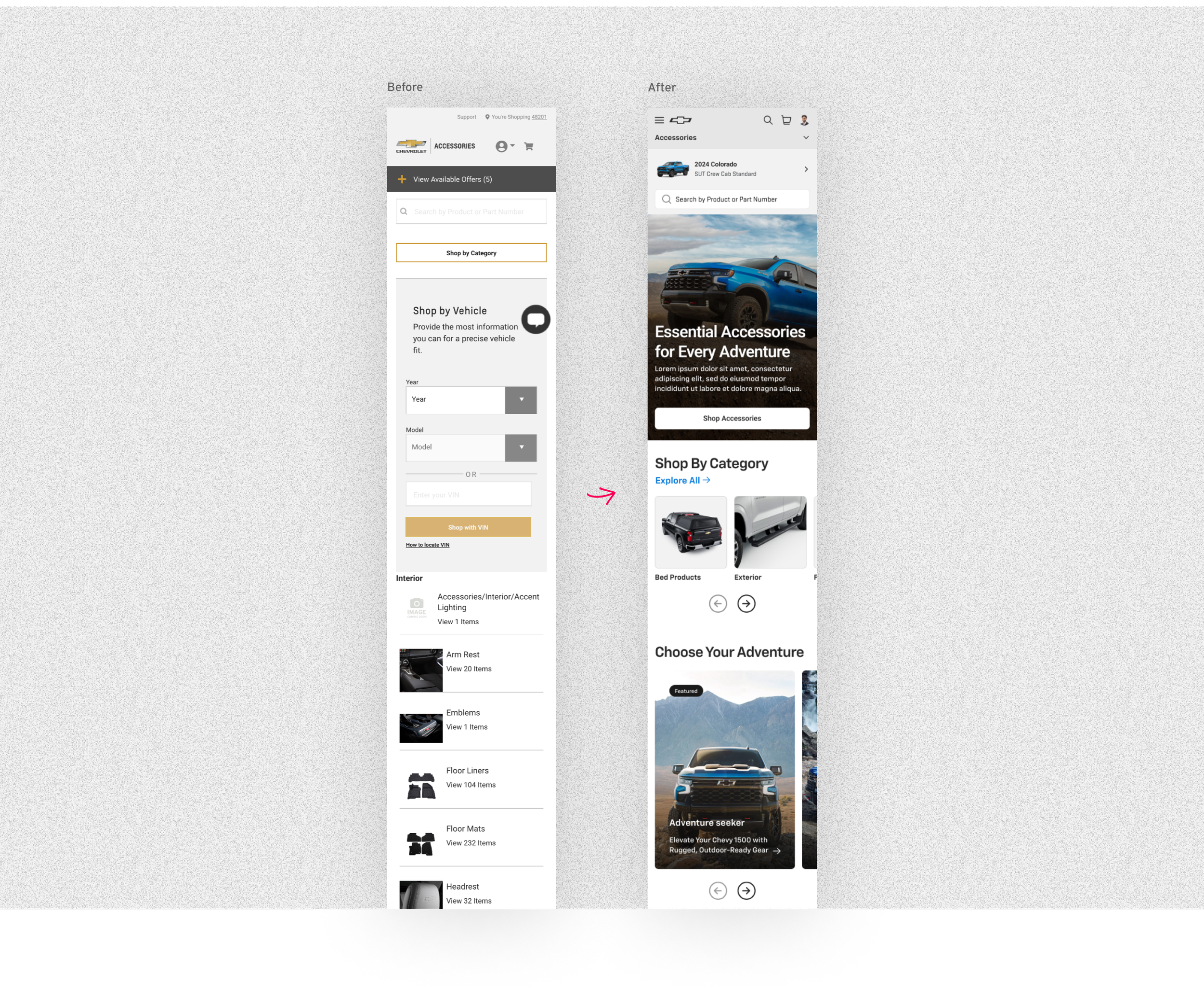
Old Vs. New
As you can observe, the old website consistently struggled with establishing a clear information hierarchy, maintaining proper organization, and effectively showcasing the unique personality of each individual brand.

Adding a grid
We also wanted to incorporate a grid into the new site. A grid layout on a website offers several benefits for appearance and functionality. It creates clear organization, enhancing navigation and user experience, while providing a tidy look. Grids support responsive design, allowing content to adjust seamlessly across devices. They ensure design consistency with uniform spacing and alignment, presenting a professional image that strengthens brand identity. Additionally, grids balance visual elements, highlighting important areas and reducing clutter for better user engagement. Lastly, a grid system accelerates the design process, enabling designers to reuse templates and focus on user experience. Overall, integrating a grid improves online presence through enhanced user experience, responsiveness, consistency, visual balance, and efficiency.
Vertical Spacing
Having a consistent vertical spacing throughout the design is also important for maintaining visual harmony and balance. This attention to detail can enhance the overall aesthetic and readability of the content, allowing users to navigate the material more comfortably.

Figma Library
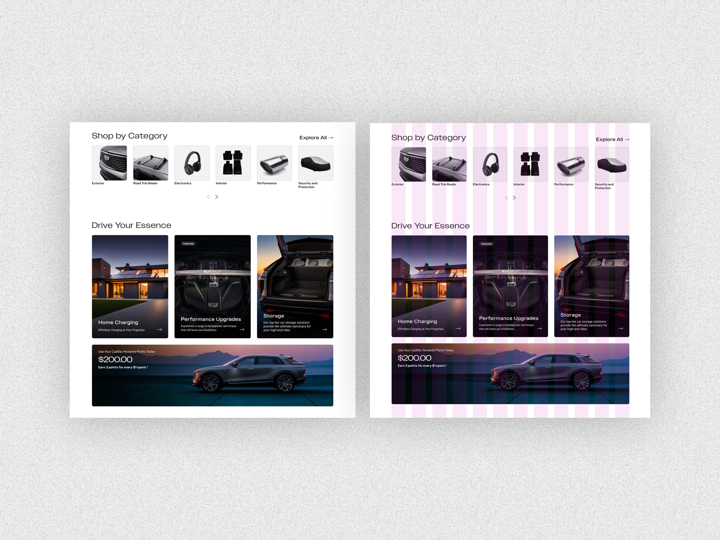
A Figma library was used on this project that was created by a separate team to be used across GM. This library included all brands colors and fonts. These could be easily switched between within the Figma app. Figma’s alias feature was used to easily flip between different brands colors and also between light and dark mode themes.

Components
My responsibility was to create the specific components used across the e-commerce pages using the Figma brand library as a base. These components all had their own variables that could then be managed in Figma and also by the content team using a CMS for launching pages. The components included mastheads, content cards and product cards in both desktop and mobile device sizes.
For consistency every inset component or in other words components that fit within the site content width, had 8px rounded corners. If the component had text over an image, a gradient overlay was added for better contrast and therefore more accessible.

One good example for showcasing the variability of these components is Product Cards. Variable components within the Product Card include “Fitment” and “Stock Info”. Furthermore, On General Motors E-commerce pages product cards can change depending on if you shopping in the “Accessories” or “Parts” section of the website. For “Parts” we need to list the “Seller Price” next to the MSRP price and also show a “Core Charge” if there is one. There is also a badge for parts classification that is title “OE”.
We also wanted to ensure that each page and component possessed modular capabilities, allowing for greater flexibility and ease of use in various contexts. This approach would enable us to adapt and restructure elements efficiently as needed.
Conclusion
Overall, the site was a resounding success when showcasing our work to the leadership team at General Motors. The enhanced user experience and the reinforcement of each brand's distinct identity significantly improved the overall quality of the websites. Additionally, the sites were modernized and brought up to date with the latest design standards, which aligned with the leadership's goal of positioning General Motors as a leader in innovation within the automotive industry.
However, the implementation and release of the site presented a hurdle. This was largely due to the substantial changes required to the existing styles, components, and content management system. As a result, we were instructed to update the site in sections, which temporarily gave the site a disjointed appearance, undermining the purpose of improving the user experience. Furthermore, working with a design library that was not yet finalized created confusion regarding the basic building blocks, such as font styles and buttons. To address this challenge, I made a concerted effort to consistently meet with a member of the design library team to coordinate the components I was creating for the site updates.
Despite these challenges, I gained valuable insights into effectively implementing site changes at a company the size of General Motors. The small details in design can have a significant impact on the overall look and user experience of a website, and it is crucial to pay close attention to these nuances to ensure a successful outcome.